Before you can boost your website’s conversions, you have to get a clear picture of what’s happening right now. It all starts with understanding your user's journey and finding the exact spots where they get stuck or give up. This means auditing your conversion funnel to find the drop-off points, then using tools like heatmaps to see why they're leaving. Only then can you make smart, data-backed improvements instead of just guessing.
Building Your Foundation For Higher Conversions
Before you even think about A/B testing button colors or obsessing over headline copy, you need to lay the groundwork. The most critical first step is simply understanding where your website stands today and what your visitors are actually trying to do. Without this baseline, any changes you make are just random shots in the dark.
So many businesses jump straight to thinking they need a massive, expensive redesign to fix their conversion problems. But honestly? Targeted, strategic tweaks can deliver far better (and faster) results. The goal isn’t to make the site prettier; it's to create a clearer, more efficient path for your users to get what they want.
Pinpoint Leaks in Your Conversion Funnel
Think of your website as a pipeline. People come in at the top, and your job is to guide them smoothly to the end—whether that’s filling out a form, buying a product, or booking a demo. A conversion funnel audit is your way of inspecting that pipeline for leaks.
For example, a local plumbing business we worked with was getting great traffic to their "Leaky Faucet Repair" page but saw very few form submissions. When we looked at their analytics, we saw a massive 50% drop-off between the service page and the contact page. They had found a major leak. It turned out their call-to-action button was buried at the bottom of the page, nearly invisible. Simply moving it to a more prominent spot plugged that leak and increased their qualified leads.
Getting this foundational understanding of your problem areas is non-negotiable. For a deeper dive into the specifics, check out this excellent guide on How to Optimize Website Conversions.
Use Data to Understand Visitor Behavior
Okay, so you've found where people are dropping off. Now comes the exciting part: figuring out why. This is where user behavior analytics tools are invaluable. You get to stop guessing and start seeing how real people actually interact with your site.
- Heatmaps: These are fantastic. They create a visual map showing where users click, move their mouse, and scroll. We once saw a heatmap for a client where dozens of people were clicking on a beautiful stock photo that wasn't a link. This told us instantly that visitors expected more information there, leading us to add a relevant case study link that improved engagement.
- Session Recordings: Think of these as a screen recording of a user's entire visit. Watching just a handful of these can be an absolute game-changer. You’ll see exactly where they hesitate, get confused, or struggle with navigation in ways you never would have imagined.
The process is straightforward: audit your site to find the problems, analyze the data to understand the "why," and then implement improvements based on what you’ve learned.
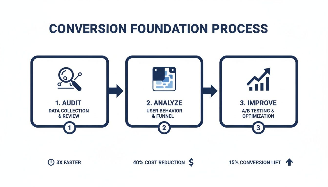
This visual really drives home the point that meaningful improvement isn't about random tweaks. It's a structured cycle of diagnosis and targeted action.
Your Initial Conversion Audit Checklist
To get you started, here is a quick reference table. Use this to guide your initial audit and make sure you're covering the essential bases before you start making changes.
| Audit Area | Key Question to Answer | Tool or Method |
|---|---|---|
| User Flow & Funnel | Where are the biggest drop-offs between key pages (e.g., landing > product > checkout)? | Google Analytics, Mixpanel, Heap |
| On-Page Behavior | Are users clicking where I want them to? Are they seeing the most important content? | Hotjar, Crazy Egg (Heatmaps, Scrollmaps) |
| Qualitative Feedback | What are actual users saying about their experience? What are their pain points? | User Surveys, Session Recordings |
| Page Speed | Is slow loading time causing people to bounce before the page even loads? | Google PageSpeed Insights, GTmetrix |
| Call to Action (CTA) | Is the primary CTA clear, visible, and compelling on every critical page? | Manual review, Heuristic analysis |
Walking through this checklist gives you a solid, multi-faceted view of what’s really going on, moving you from assumptions to actionable insights.
This foundational work also gives a nice boost to your SEO efforts. Looking ahead, optimizing for SEO traffic is one of the most reliable ways to get more conversions. Organic search delivers an average conversion rate of 2.3% across most industries, often outperforming paid ads because you're attracting people who are actively searching for what you offer. For those running specialized sites, you might find our guide on how to build a membership website helpful for converting visitors into loyal members.
By grounding your strategy in real user data, you move from assumptions to empathy. You start solving actual customer problems, which is the secret to creating a website that not only attracts visitors but also turns them into loyal customers.
Fine-Tuning Your User Experience and Design
Once you have your analytics and goals sorted, the next big win is almost always found in the user experience itself. Let’s be blunt: a website that's confusing, slow, or difficult to use on a phone will absolutely hurt your conversions. It doesn't matter how great your product is; if people can't easily navigate your digital "storefront," they're not coming inside.
Think of your site's design and UX as the path of least resistance. Our job is to smooth out that path, removing any friction that makes it hard for visitors to find what they need and do what you want them to. You'd be surprised how often small, thoughtful fixes can deliver a much bigger lift than a full-blown redesign.
Nail Your Navigation
Ever landed on a website and felt immediately lost? We all have. It’s a frustrating experience, and most people won’t stick around to play detective—they’ll just leave.
Your navigation needs to be so obvious that a first-time visitor gets it in seconds. A good principle to follow is the "three-click rule." Can someone find any essential information on your site within three clicks? If not, you’ve got work to do.
Here are a few ways to make your navigation crystal clear:
- Use Plain Language: Ditch the clever, branded terms for your menu. Stick with what people know: "Services," "About Us," "Pricing," "Contact." Clarity beats cleverness every time.
- Keep Your Main Menu Lean: A cluttered menu is an overwhelming menu. Try to limit it to five to seven essential items. This forces you to focus on what truly matters to your user.
- Make Search Easy to Find: If your site is content-heavy, a prominent search bar isn't a luxury; it's a necessity. Don't make people hunt for it.
When navigation is easy, you empower visitors to explore on their own terms, guiding them seamlessly toward your conversion goals without them even realizing it.
Treat Mobile as Your Top Priority
Let's get one thing straight: having a clunky mobile experience in this day and age is a massive liability. Mobile optimization is no longer optional. Just look at the numbers—mobile traffic accounts for 73% of e-commerce visits.
But here's the kicker: the mobile conversion rate is a paltry 2.9%, while desktop sits at a much healthier 4.8%. That gap represents a huge opportunity. With a projected $2.51 trillion in mobile commerce sales on the line, ignoring mobile UX is like leaving cash on the table. You can dig deeper into these figures and learn more about e-commerce benchmarks to see how you stack up.
And true mobile optimization isn't just about making your site shrink to fit a small screen. It's a complete shift in mindset. It's about designing for the mobile user first.
Think about the context of a mobile user. They're likely on the move, possibly using one hand, and might be on a spotty data connection. Your design has to account for this. That means big, tappable buttons, simple forms, and zero clutter.
For a local restaurant client, we implemented a "Click to Call" button and made their address instantly open in Google Maps. These simple, thoughtful touches made a huge difference in dinner reservations and were a deciding factor for mobile users looking for a place to eat nearby.
Eliminate Slow Page Speeds
Nothing says "we don't respect your time" like a slow-loading website. Page speed isn't just a nerdy technical metric; it's a core part of your customer service. The data is clear: even a one-second delay can cause a 7% drop in conversions. People are impatient online. A slow site just feels unprofessional.
The team at web.dev breaks down web performance into a few core components that directly shape how users perceive your site's speed.
As you can see, it's not just about raw speed but also about how quickly the page becomes interactive and visually stable.
The good news is you don't always need a developer to make meaningful improvements. Here are a few things you can tackle right away:
- Compress your images. This is the low-hanging fruit. Huge image files are the number one cause of slow pages. Use a tool like TinyPNG to shrink file sizes without killing quality.
- Set up browser caching. This tells a visitor's browser to save parts of your site locally, so it loads much faster on return visits. If you're on WordPress, plugins like W3 Total Cache can handle this for you.
- Minify your code. This involves stripping out unnecessary characters from your HTML, CSS, and JavaScript. It might sound technical, but many plugins and platform tools can automate this process.
By focusing on these three pillars of user experience—navigation, mobile, and speed—you create a frictionless environment that makes it easy for visitors to say "yes" to whatever you're offering.
Crafting Compelling Copy And Calls To Action
If your website's design is the storefront, your copy is the expert salesperson working for you 24/7. It's the silent guide that persuades visitors and convinces them to take that next, crucial step. You can have the most beautiful, intuitive website in the world, but if the messaging falls flat, so will your conversion rates.
Think about it from your visitor’s point of view. The moment they land on your page, a series of questions pop into their head: "Is this for me?" "Do they actually understand my problem?" "Why should I trust them over anyone else?" Your words need to answer these questions—and fast.
Speak Directly To Customer Pain Points
Here’s a hard truth: generic copy that tries to please everyone ends up connecting with no one. The most powerful copy speaks directly to the specific frustrations, challenges, and desires of your ideal customer. It proves you get it.
It’s all about shifting from features to solutions. A roofer shouldn't just list, "We use architectural shingles." Instead, they should frame it as a direct benefit: "Protect your home for decades with our storm-resistant architectural shingles, giving you peace of mind through any weather."
This requires empathy. You have to get inside your customer's head. What keeps them up at night? What goal are they desperately trying to reach? When your copy mirrors that understanding, you build an instant rapport and establish yourself as an authority.
Build Trust With Social Proof
People are naturally skeptical, especially online. You can claim your product is the best all day long, but it’s a thousand times more powerful when a happy customer says it for you. This is the magic of social proof, and it’s an absolute must-have for high-converting pages.
Weaving social proof into your website isn't complicated. Here are a few ways we've seen work wonders:
- Client Testimonials: Place short, punchy quotes from satisfied customers right next to key decision points, like a "Request a Quote" button.
- Case Studies: For B2B, nothing beats a detailed case study that breaks down exactly how you solved a real-world problem for a client.
- Client Logos: Showing the logos of well-known companies you've worked with offers an immediate credibility boost.
This isn't just about patting yourself on the back. It’s about reducing perceived risk for the potential customer. Seeing that others have already trusted you—and were happy with the result—makes their own decision feel much safer.
The Anatomy Of A High-Converting CTA
Your Call to Action (CTA) is arguably the most important snippet of copy on any page. It’s the final instruction, the moment of truth. A weak or passive CTA can stop your entire conversion funnel dead in its tracks.
Forget generic buttons like "Submit" or "Learn More." A truly effective CTA needs to be clear, urgent, and packed with value.
A great CTA answers the user's unspoken question: "What's in it for me if I click this?" The button text should complete the sentence, "I want to…" For example, "I want to Get My Free Quote" or "I want to Download the Guide."
Once you have compelling copy in place, learning how to write a call to action that actually converts is the final piece of the puzzle. It’s amazing what a difference a few carefully chosen words can make.
To see what this means in practice, just look at how small wording changes can lead to a big impact.
CTA Wording Examples Before And After
| Generic CTA | High-Converting Alternative | Why It Works |
|---|---|---|
| Submit | Get My Free Marketing Plan | Focuses on the valuable outcome for the user, not the boring action they're taking. |
| Sign Up | Start My 14-Day Free Trial | It’s specific, highlights the "free" trial, and manages expectations perfectly. |
| Contact Us | Schedule a 15-Minute Discovery Call | This removes friction by specifying a low time commitment and a clear purpose for the call. |
See the pattern? The stronger CTAs are personal ("My"), action-oriented ("Get," "Start"), and communicate immediate value. When you combine this kind of direct, benefit-driven language with social proof, you create a persuasive flow that naturally turns visitors into customers.
Implementing A Smart Testing And Analytics Plan
Assumptions are the enemy of growth. In business, what you think will work often isn't what actually moves the needle. This is where a real commitment to data-driven decisions separates the amateurs from the pros. Instead of going with your gut, you can build a systematic process for testing, learning, and constantly improving how your website performs.
This isn’t about getting lost in spreadsheets or needing a Ph.D. in data science. It’s about creating a simple, repeatable framework to understand what your audience truly responds to. When you build a culture of testing, you can systematically increase website conversions and make growth far more predictable.
Demystifying A/B Testing
At its heart, A/B testing (or split testing) is a beautifully simple idea. You show two different versions of the same web page to different groups of visitors at the same time. Then, you just watch to see which one performs better. It's the most effective way to take all the guesswork out of your optimization work.
The secret to a good A/B test is a solid hypothesis. This isn't just a random idea—it's an educated guess based on what you’ve already learned from your website audit and user behavior analysis.
For example, a weak hypothesis is, "Let's change the button color and see what happens." A strong, data-driven hypothesis sounds more like this: "Our heatmaps show people are hesitating before clicking our 'Submit' button. We believe changing the button copy to 'Get My Free Quote' will clarify the immediate value and increase form submissions by 15% because it's more specific and less committal."
A/B testing is basically a conversation with your audience where you listen with data. It lets them show you, through their actions, what they actually prefer—from headlines and button text to page layouts and images.
Choosing What To Test For The Biggest Impact
You can test almost anything on a webpage, but your time is limited. To get the biggest bang for your buck, you need to focus your first tests on the elements that have the highest potential to change user behavior.
Here are a few high-impact areas to start with:
- Your Main Headline: This is your first, and maybe only, impression. Pit a benefit-driven headline against a more feature-focused one.
- Call-to-Action (CTA) Button: Play around with the text, color, size, and placement of your main CTA. A simple wording tweak can deliver unbelievable results. If you're looking for more ideas, our article on how to boost email clicks easily has some great tips that can apply to your website, too.
- Page Layout: Try a clean, single-column layout against a multi-column design. Does one reduce distraction and guide users to the conversion goal more effectively?
- Social Proof Placement: Move your best client testimonial or a trust badge right next to your CTA button. See if that little bit of reassurance at the critical moment of decision reduces friction.
Setting Up Meaningful Conversion Tracking
A test is completely useless if you can’t accurately measure the outcome. This is why setting up proper conversion tracking in a tool like Google Analytics is non-negotiable. The goal is to track the actions that actually matter to your business, not just vanity metrics like page views.
A conversion goal could be anything from a completed contact form and a product purchase to a newsletter signup. When these goals are set up correctly, you can directly tie your website changes to real business outcomes. You can confidently say, "Version B of our landing page generated 242% more qualified leads than Version A." That kind of clarity is empowering; it tells you exactly where to invest your time and what to ditch.
This entire process—from hypothesis to tracking—creates a powerful feedback loop. You spot a problem, propose a solution, test it, and let the data tell you the winner. It's a simple but profound shift that turns your website from a static online brochure into a dynamic, ever-improving sales machine.
Advanced Strategies For Your Industry
Let's be clear: conversion optimization is not a "one-size-fits-all" playbook. The tactics that sell sneakers for an e-commerce giant will fall completely flat for a healthcare clinic trying to book appointments. The secret sauce is getting inside the head of your specific audience and understanding what really motivates them.
This is where we graduate from general best practices and dive into the nuanced strategies that give you a real edge. It’s about applying the core principles we’ve covered to the unique pressures and psychologies of your specific field.
Here’s how this looks in the real world across three very different sectors.
For Healthcare Clinics Building Patient Trust
When it comes to healthcare, the most valuable currency you have is trust. A potential patient landing on your clinic’s website is often feeling vulnerable, maybe even a little scared. Your site’s most important job is to be a source of calm, reassurance, and expertise.
We once worked with a dental clinic that was baffled by the high drop-off rate on their "Book an Appointment" page. Their site looked clean and professional, but it was sterile—it lacked a human touch. We tested adding high-quality photos and short bios for each dentist, sharing their credentials, years of practice, and a friendly little "about me" section.
That small change made a world of difference. It turned an anonymous clinic into a team of approachable, real people you could trust. The result? A 25% jump in online appointment bookings in a single quarter.
To cultivate that kind of trust, you can focus on:
- Showcasing Credentials: Don't be shy. Put certifications, awards, and professional affiliations front and center.
- Patient Testimonials: Nothing builds confidence like hearing from other happy patients. Use real stories (with permission!) to create powerful social proof. Video testimonials are pure gold here.
- Frictionless Booking: Make scheduling an appointment ridiculously simple. Think clear instructions and the absolute minimum number of form fields.
For Nonprofits Inspiring Action
A nonprofit isn't selling a product; you're selling a mission. Your goal is to forge an emotional connection so powerful that it moves people to give their time or money. This is where compelling storytelling becomes your single most effective conversion tool.
Consider a local animal shelter we saw that had a lackluster donation page. It was just a generic form with a "Donate Now" button—functional, but totally uninspired.
They decided to completely revamp it. The new page led with the heart-wrenching story of a single rescued dog, complete with a video of its recovery. They even changed the button text from a dry "Donate" to an urgent "Help Save a Life." Shifting the frame from a simple transaction to an emotional appeal led to a 40% lift in online donations.
The data absolutely supports this focus on trust and clear calls to action. Even with tight HIPAA compliance, healthcare appointment bookings can see conversion rates between 2.8% and 4.2%. You can discover more insights about industry conversion benchmarks to see how others balance compliance with effective marketing.
For nonprofits, a conversion isn't just a click—it's an act of belief. Your website must translate your mission into a tangible, emotional story that makes the visitor the hero for taking action.
For E-commerce Businesses Reducing Cart Abandonment
For any online store, the checkout is the final hurdle. This is where sales are won or lost. Even the tiniest bit of friction at this stage can send your cart abandonment rates through the roof. The mission is simple: make buying from you as fast, easy, and secure as humanly possible.
A great example comes from an online clothing boutique that was hemorrhaging sales with a cart abandonment rate over 75%. We dug into their session recordings and found two massive roadblocks: forcing users to create an account and springing surprise shipping costs on them at the very end.
We rolled out two straightforward changes:
- Introduced a "Guest Checkout" option, letting people buy without the hassle of creating a new account.
- Added a shipping calculator right on the product pages, so customers knew the all-in cost from the start.
By streamlining the path to purchase and eliminating surprises, their cart abandonment rate plummeted to under 55% in just two months. That’s a direct injection of revenue.
These stories all point to the same truth: understanding your industry's unique pain points is the key to figuring out how to increase website conversions. It's really about empathy—putting yourself in your customer’s shoes and methodically knocking down every barrier in their way.
If you’re not sure which specific levers to pull for your business, an outside perspective can help. A personalized plan can make all the difference. We invite you to reach out, and we can map out a strategy that fits your industry and your goals.
Even after you’ve mapped out a solid CRO plan, some questions always pop up. It’s only natural. We've put together this final section to tackle the most common questions we get from clients.
Think of it as a quick FAQ to help you set realistic expectations and move forward with confidence as you start digging into your own site’s performance.
What Is a Good Website Conversion Rate?
This is the million-dollar question, and the honest answer is always: it depends. A "good" conversion rate is completely relative. It changes dramatically depending on your industry, where your traffic is coming from, and the specific action you're asking a user to take.
For instance, a 2% conversion rate could be absolutely phenomenal for an e-commerce store selling high-ticket furniture. But a 10% conversion rate for a free newsletter signup? That might just be average.
To give you a rough idea, here are a few general benchmarks we've seen over the years:
- E-commerce: You'll typically see these fall somewhere between 1% and 3%.
- B2B Lead Gen (Forms): This can be a bit wider, often ranging from 2% to 5%.
- Healthcare (Appointments): Usually lands in the 2% to 4% ballpark.
Here’s the thing: your most important benchmark isn’t some industry average. It's your own historical data. The real goal is continuous improvement. If you can push your rate from 1.5% to 2.0%, that’s a 33% increase in conversions—a massive win.
How Long Does It Take to See Results?
This is another area where it’s crucial to manage expectations. While a few small tweaks can sometimes produce surprisingly fast results, real conversion optimization is a long-term commitment.
We once worked with a B2B software client who had a seriously underperforming "Request a Demo" page. We started small, just rewriting the headline and adding a sentence clarifying what happens after you submit the form. That simple change led to a 242% increase in submissions from that one page in under two months.
That was a fantastic quick win, but it was just one piece of a much larger strategy. More complex changes, like a full user flow overhaul on their homepage, took much longer to prove their worth as we waited to gather enough data.
How long you'll have to wait really boils down to three things:
- Your Website Traffic: The more traffic you have, the faster your A/B tests will reach statistical significance. A site with 100,000 monthly visitors might validate a test in a week, while a site with 5,000 visitors could need a month or more for the same test.
- The Scope of Your Changes: Tweaking the text on a CTA button is quick to test and measure. A complete redesign of a product page? That requires a lot more time to implement and properly evaluate.
- The Problem You're Solving: If you're fixing something obviously broken, like a form that won't submit on mobile, you'll see an immediate lift. If you're refining subtle messaging, that takes more iteration and patience.
What Should I Test First for the Biggest Impact?
When you’re just starting out, the temptation to test everything is strong. But a scattered approach is a recipe for frustration. To get the most significant wins early on, you need to be strategic.
Focus on the pages and elements that have the most leverage—your "money" pages. These are the ones closest to the actual conversion.
We almost always tell clients to start with these three high-impact areas:
- Your Main Call to Action (CTA): This is the lowest-hanging fruit. Seriously. Test the button text, the color, and its placement on your most important pages. There's a reason changing "Submit" to "Get My Free Quote" is a classic test—it works.
- Your Primary Headline: It’s the very first thing people read. Pit a clear, benefit-driven headline against a more feature-focused one. Does "Cloud Accounting Software" perform better than "Save 10 Hours a Week on Your Bookkeeping"? Only a test will tell you for sure.
- Your Forms: Long, complicated forms are absolute conversion killers. Try removing every single field that isn't absolutely essential. If your contact form has 10 fields, can you get the same job done with just three? Every field you cut makes it that much easier for someone to convert.
By zeroing in on these critical touchpoints first, you maximize your chances of seeing meaningful improvements right away. This builds momentum and gives you hard data to inform your next round of tests, turning guesswork into a repeatable engine for growth.
Feeling a bit overwhelmed or just not sure where to start? The team at Studio Blue Creative has spent more than a decade helping businesses plan, build, and optimize their digital experiences. We can help you pinpoint the highest-impact opportunities for your industry and turn more of your visitors into loyal customers.
Let's talk about building a strategy that gets you real results. Contact us today for a free consultation.
Find out if ChatGPT recommends your business.
Right now, your customers are asking AI for recommendations. The AI is naming somebody. Is that name yours? Run our free AEO Scorecard — we test 3 of your real queries against ChatGPT and Claude and email you a personalized report.